Last year, in a move opposed by over 90% of Australian citizens, the Australian government under Prime Minister Tony Abbott formally requested the de-listing of the Tasmanian Wilderness as an UNESCO World Heritage Site. The Abbott administration wanted to revoke the status to allow logging within the protected area. If successful, the bid would have marked the first time a developed nation de-listed a protected site for purely economic purposes.

Clearly this region has little intrinsic value.
(Lake Pedder from Mt Eliza. Image credit: JJ Harrison, Wikimedia Commons)
Citizens and environmental organizations quickly acted to oppose the unpopular bid. The Australian Conservation Foundation (ACF), as part of a coalition, asked its members to sign petitions, write letters to newspapers, call their representatives, deliver trees to representatives, attend rallies, and donate in a comprehensive effort to protect the Tasmanian Wilderness.
The coalition delivered a petition with over 360,000 signatures to UNESCO’s World Heritage Committee. In June 2014, in under seven minutes, the Committee unanimously rejected the Australian government’s bid.
This victory was just one of the Australian Conservation Foundation’s many efforts to safeguard Australia’s natural wonders. As an advocacy organization, they work to engage, develop, and mobilize the environmentalist movement in Australia.
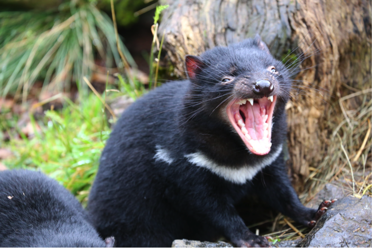
“Follow me … to VICTORY!”
(Tasmanian devil. Image credit: Neerav Bhatt)
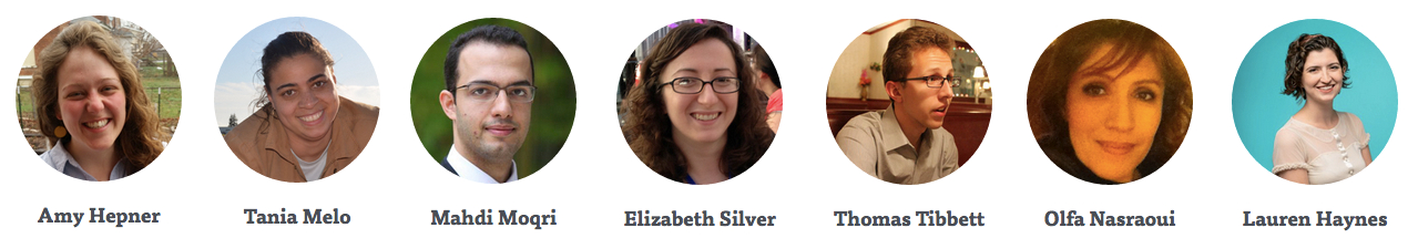
This summer, in partnership with the Eric & Wendy Schmidt Data Science for Social Good (DSSG) Fellowship at the University of Chicago, ACF will use data science to better understand their supporters and more effectively engage them. DSSG fellows Amy Hepner, Tania Melo, Mahdi Moqri, Elizabeth Silver, and Thomas Tibbett, under the guidance of Project Manager Lauren Haynes and Technical Mentor Olfa Nasraoui, are developing new approaches to reach and inspire ACF’s audience.
We are approaching this task on three fronts. First, we’re designing experiments ACF can run during the summer and beyond, testing different strategies for engaging supporters. Next, we’re generating insights about ACF’s supporters using data exploration and clustering techniques. Finally, we are building models to predict which individuals will engage with an email, and which emails are most likely to engage supporters.

“Have they tried SnapChat?”
(Emu. Image credit: Jennifer Blakeslee)
We need individual-level information to predict which people should be targeted for particular campaigns. We’re using demographic and historical data from ACF email campaigns and responses (clicks, donations, online signups) from their constituents. The predictive models focus on the rates at which different constituent groups open the email, click on the action (e.g. click the “donate” button or the “sign the petition” button), and follow-through with the action (i.e. actually donate or sign the petition).
Unlike other projects in DSSG, we focus on running experiments. ACF is allowing us to send multiple versions of some of the emails they are sending out this summer (or winter, in their case). Our predictive model of the emails will suggest that some features of the emails should work better than others, while our model of ACF’s constituents will suggest who is most likely to click on each kind of email. We’re very lucky: we don’t have to guess. Our experiments can tell us whether our models are correct or not.
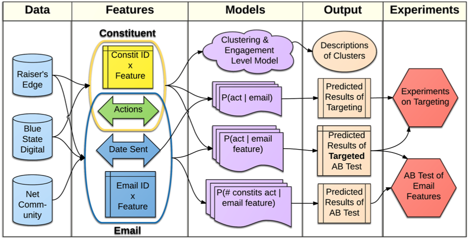
The proposed analytic pipeline.
ACF’s data is in three proprietary databases: Raiser’s Edge, NetCommunity, and Blue State Digital. They’re used by many nonprofits, so they contain more features than most nonprofits use. Our database dump of NetCommunity contained over eight thousand tables, of which almost six thousand were empty.
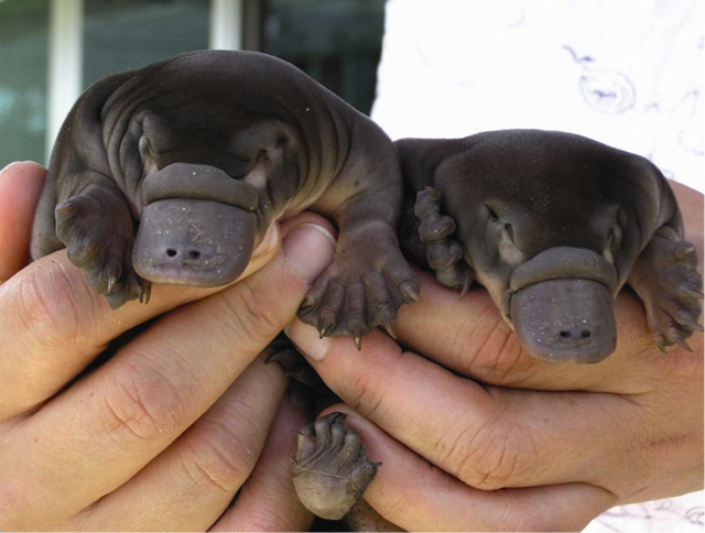
“And you thought we were confusing.”
(Baby platypuses. Image credit: Faye Bedford)
Nonprofits usually use only the “front end” of Blue State Digital. The front end gives you aggregate data: how many people signed the petition. It doesn’t tell you which people signed the petition. So ACF arranged with Blue State Digital to access all the individual-level data. Because no one sees it, the back end of Blue State Digital doesn’t need to look pretty or make sense.

“What do you mean, they named one of their columns ‘SQL’?”
(Tawny Frogmouth. Image credit: S J Bennett)
We spent weeks exploring the databases, getting the data in working shape. Fortunately, once our tools are made public, any organization using the same systems will be able to use the map we’ve drawn.
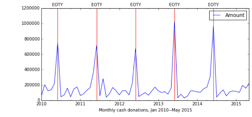
We had just begun looking at the data when ACF mentioned that the end of the Australian tax year was around the corner. They do an End Of Tax Year (EOTY) donation appeal every year, and it works. Here’s the plot of their “cash donations” (i.e. one-off rather than recurring donations) since 2010:
ACF asked us whether we’d like to run an email experiment for their EOTY appeal. At that point we had no predictive models to test, so we decided to test a couple of simple email features: short vs. long subject line, and short vs. long first line of the email.
Very quickly, it seemed that the “short subject line, short first line” version of the email brought in more money. The Blue State Digital front-end showed that this email received $160 more than the other versions – a statistically significant difference with a sample size of only 39 donations. ACF chose that version as the “winner” and sent it to the rest of their constituents.
However, when we looked at the back end of Blue State Digital, we noticed that the results had been skewed by some large donations. We tried both removing outliers, and “capping” them – that is, counting them as $100 donations rather than $150 or $250. Suddenly, all versions of the email performed roughly the same. The individual-level data can reveal details that the aggregate data can’t; sometimes, it shows you that you’re making patterns out of noise.
We did see one robust pattern: a cluster of donations at the $50 level. It turns out that ACF’s donation page has $50 as the smallest suggested donation. Even though there is an “Other: $ ___” box, so you can donate as little as you like, it’s conventional wisdom in nonprofit marketing that most people either donate the suggested minimum amount, or don’t donate at all. This suggests an experiment that doesn’t use email at all: varying the suggested minimum donation.
There are obvious risks to this experiment. The modifications might not bring in any new donors; and even if they do, the total dollar value might be lower with a lower default minimum amount. However, if the current system is losing ACF money, we believe they ought to find out!

Australian money: cuter than any other money.
(Five cent coin, featuring an echidna. Image credit: Karl Baron)
While designing and running experiments based on our exploratory analysis of ACF’s data, we’ve begun building our predictive models, which in turn suggest interesting email features to test in future experiments: the tone, the values each email appeals to, whether the donation is for a clear cause, etc. We’re entering a feedback loop where we make predictions, test those predictions with experiments, and use the experimental results to update our predictive models.
We’ve also been working to get an overview of ACF’s supporters. We want to see who is most engaged and active, who is interested in only a few specific issues, and who could be persuaded to speak out. We want to know about the overlap between people who donate, and those who act.
We can see how different emails engage different groups of supporters using an open rate matrix:
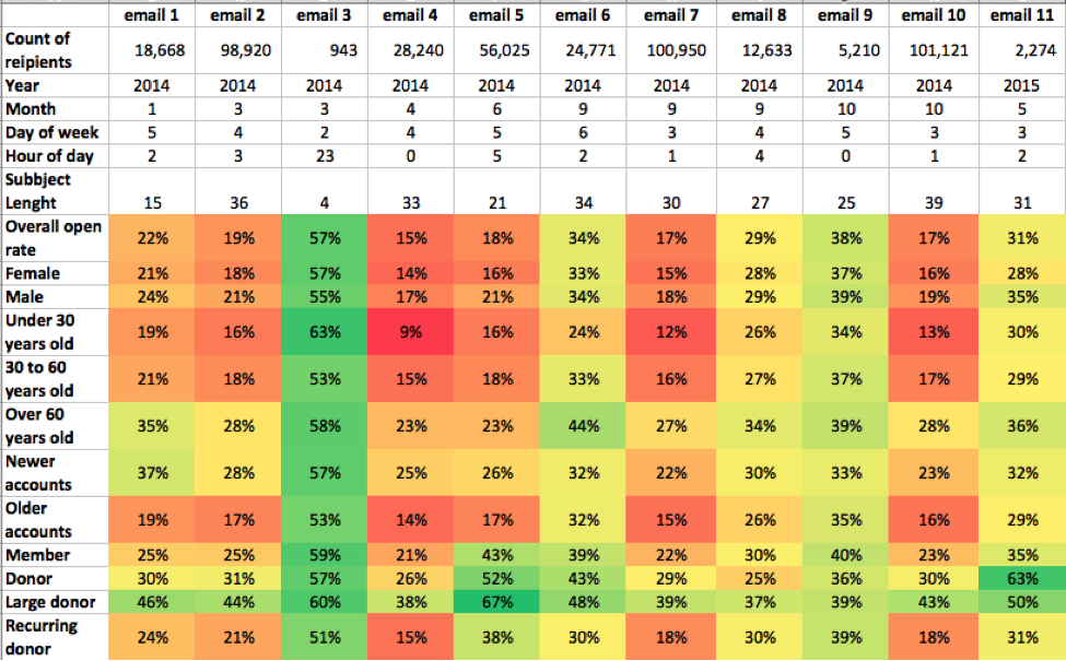
Open rate by constituent group for a sample of emails.
Some effects are global: email 3 did well with every group, and large donors open more emails than everyone else. But some groups respond differently to particular emails. Email 5 did poorly overall with only an 18% open rate, but did well among the more committed recipients (members and donors). By contrast, email 8 performs about the same among donors and among all supporters. By looking at the features of these emails, we can learn which types of emails should be sent only to particular groups of supporters.
The goal of DSSG’s partnership with ACF is to create data-driven models and an experimental toolkit to improve digital engagement. All of the tools we create will be open-source and available via GitHub. We believe that the lessons learned from this process will help ACF rally their supporters to protect the Australian environment. However, since the environment is a global concern, we plan to deliver a tool that can be adapted by non-profits anywhere on the planet. Because our world could use a little more social good, just as much as koalas, quokkas and kangaroos.

“Just say when to jump.”
(Red kangaroo. Image credit: David Cook. Cropped from original.)